Winning Entry

Ultramoderne

Yasmin Vobis, Aaron Forrest, Brett Schneider

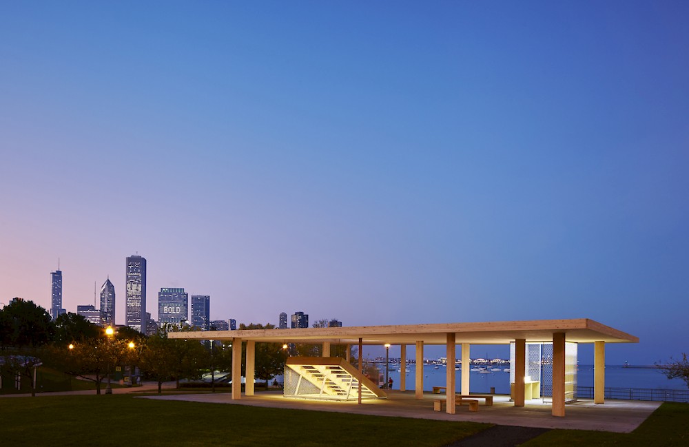
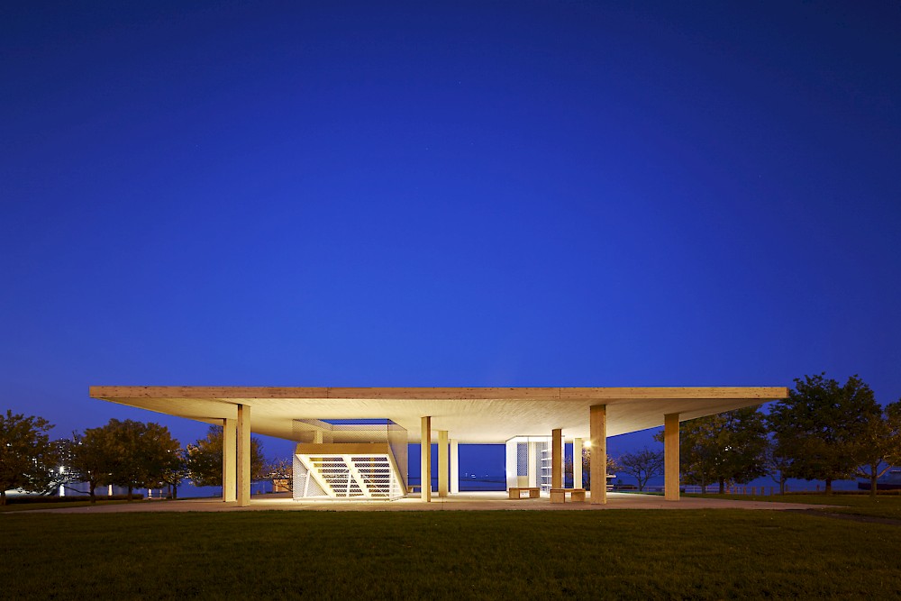
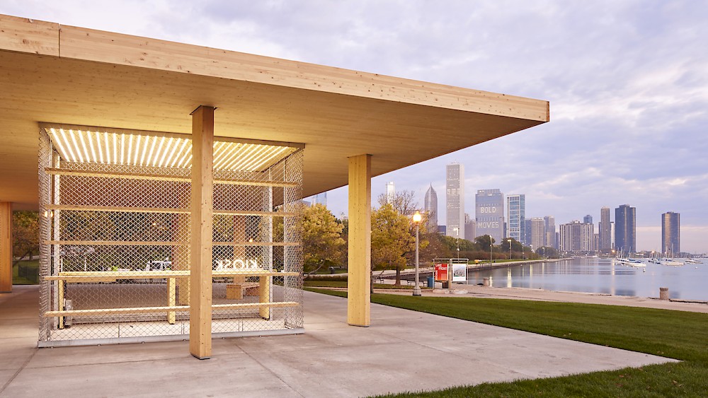
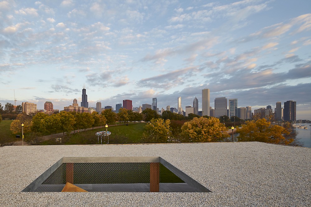
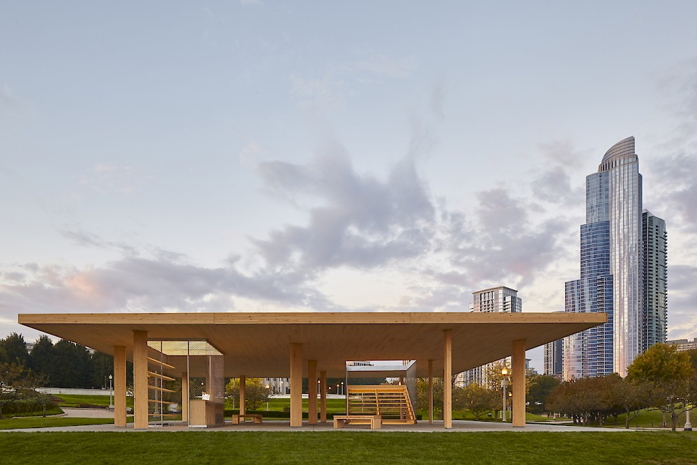
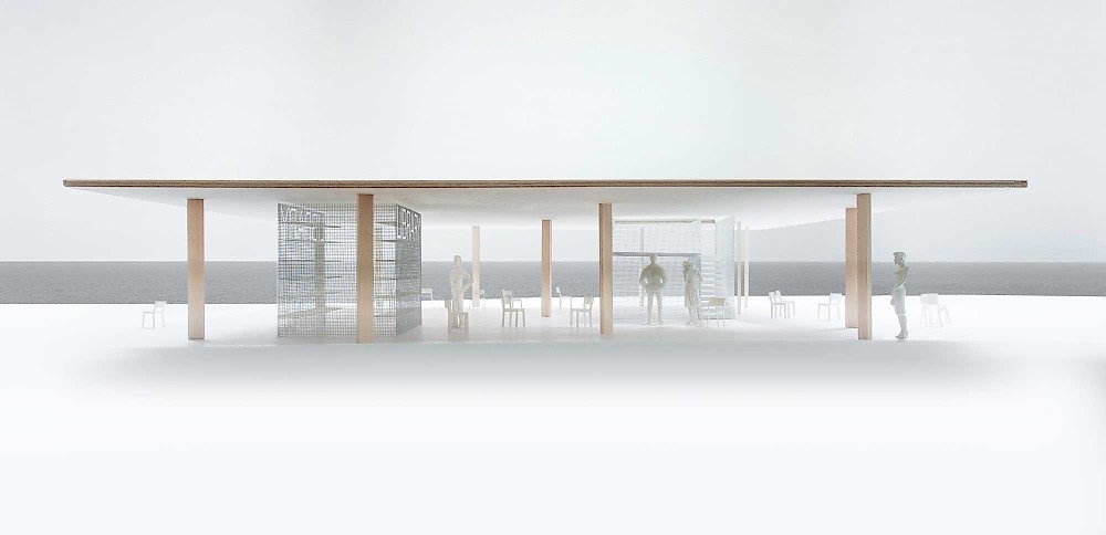
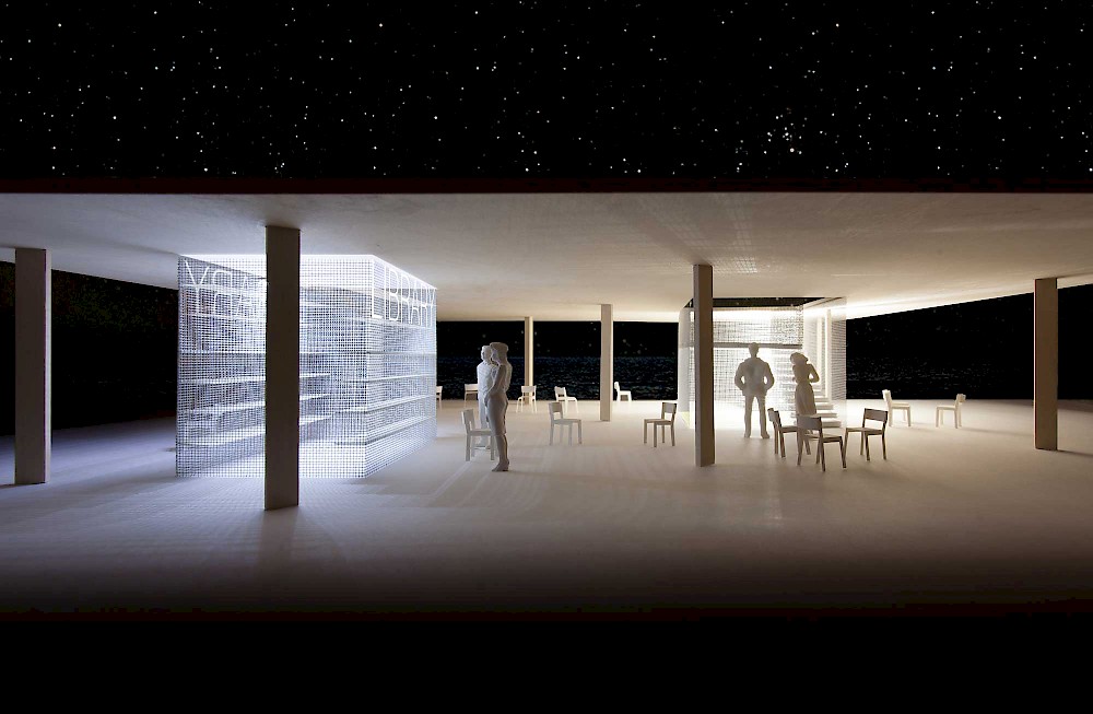
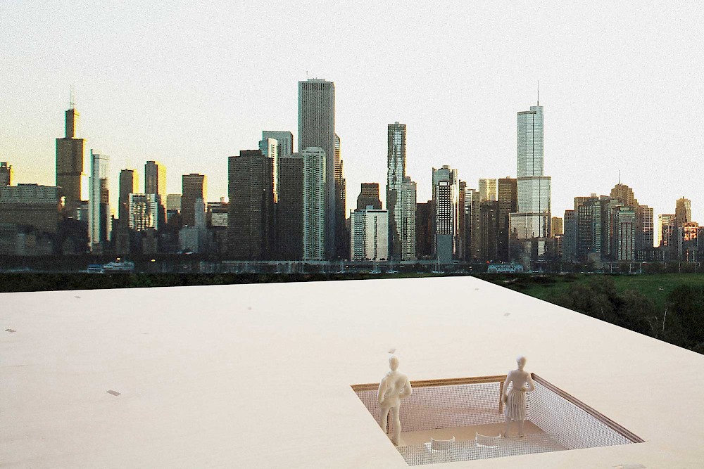
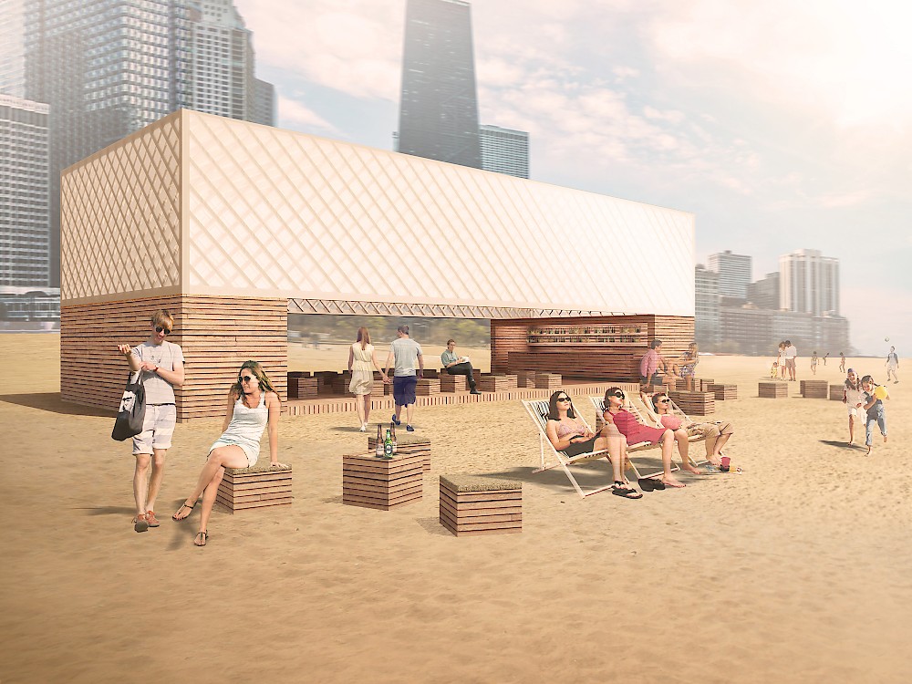
Titled Chicago Horizon, Ultramoderne’s kiosk is a quest to build the largest flat wood roof possible within a limited budget. Using Cross-Laminated Timber, a new carbon-negative engineered lumber product, in the largest dimensions commercially available, the kiosk aims to provide an excess of public space for the Architecture Biennial and Chicago beachgoers.

Ultramoderne, Providence, Rhode Island

Courtesy of Chicago Architecture Biennial / Tom Harris, 2015

Runners-Up

KELLEY, PALIDER, PAROS

Thomas Kelley, Ryan Palider, and Chuck Paros

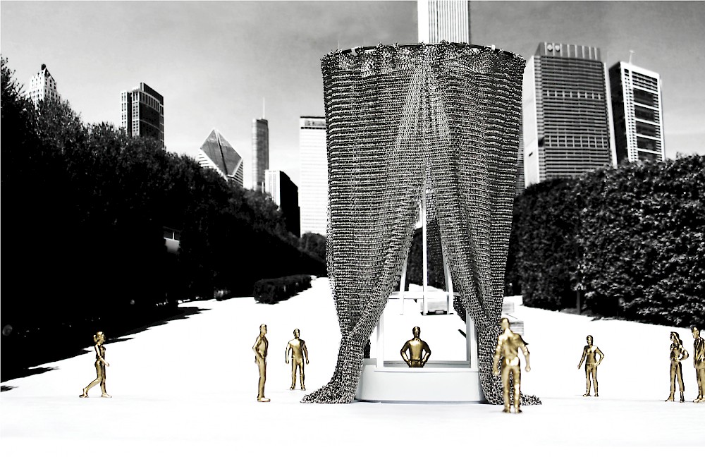
If you look closely at function, the existing kiosks along Chicago’s lakefront efficiently meet the needs of the various vendors that supply goods and services to millions of visitors each year. All summer long these modest huts are alive with energy, but for nine months of the year these once-active spaces are shuttered to form a ghost town: a constant reminder that the magic of summer in Chicago has disappeared. Our proposal for a new kiosk does not seek to reinvent the type. It functions with the same ease and efficiency as do the existing kiosks, but it does so while providing alternative readings to what constitutes a spectacular year-long interaction. A veil dangles, casting its shadows on the ground beneath. The kiosk invites the casual passersby to join in its dance. Overall, the structure is more than just a place of commerce; it is a shy icon that tempts its audience to stare into and beyond.

- Kelley, Palider, Paros, Chicago

Kelley, Palider, Paros. Behind the Curtain, 2015.

Lekker Architects

Ong Ker-Shing, Joshua Comaroff

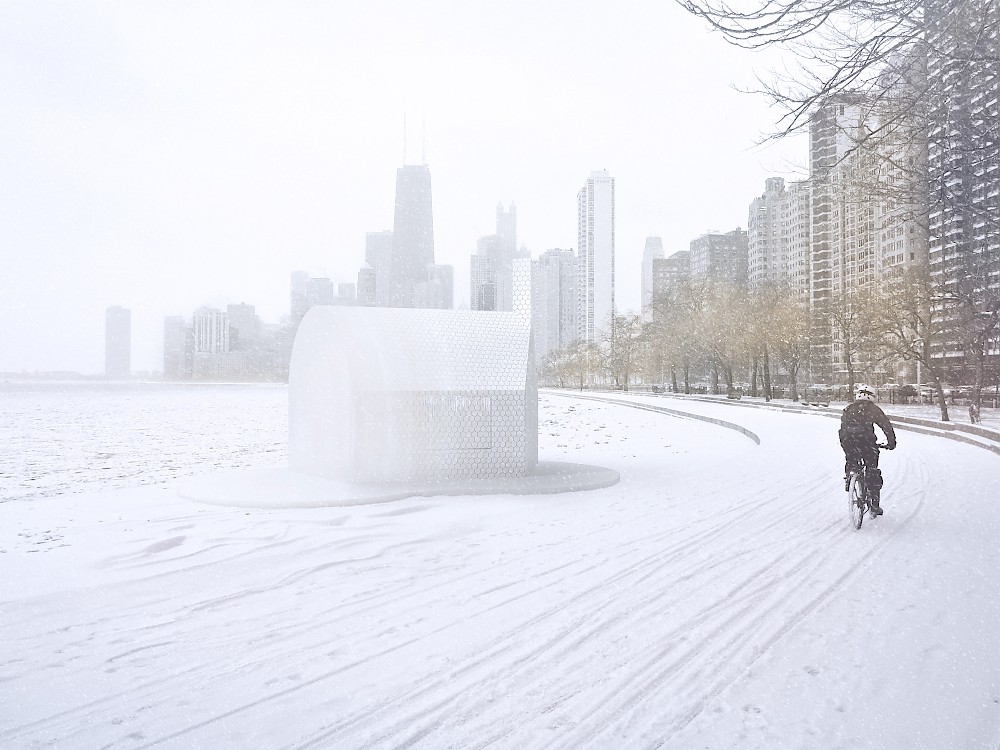
The form of this building is an attempt to express Chicago’s unlikeliness: that Chicagoan chutzpah, the strange emergence of something intricate and sophisticated in a hostile environment. It is a gradual transformation from a blank (vaguely block-like) mass into something more architectural, more refined, more domestic. For the Biennial, we imagine it as a kind of micro-venue for local music and drinks, spilling out like many of the famous jazz and blues venues of the South Side. At other warm times, it might serve as an information booth or a food stand. In the winter, it is abandoned and takes on a strange form of solidity—a frozen mass, or solid object, that appears to be only half architectural and beyond the range of human inhabitation.

Lekker Architects, Singapore 

Lekker Architects. Lakefront Kiosk Competition entry, 2015.

TRU Architekten

Tim Bauerfeind, Dirk Bertuleit, Anno Lingens, Karsten Ruf, Sandra Töpfer, and Henning von Wedemeyer

Our goal is to establish the kiosk as a place for social interaction within the public space, a cheap tool for cultural exchange. Therefore, we designed a piece of architecture with the greatest simplicity and structural clarity. The Lakefront Kiosk is meant to be adopted and changed by its users. The wooden platform provides an open, weather-protected space for installations and spatial interventions, and various lighting concepts can be realized with the lantern atop of the kiosk. During the Biennial, the kiosk could be established as a forum for young architects, hosting lectures, discussions, exhibitions, installations, film screenings, and parties.

The Lakefront Kiosk should not stand in rivalry with other built objects. Besides the optional sites proposed by the Biennial team, we can imagine locating the kiosk at one of Chicago’s city beaches. Along the coastline, several locations provide the desired intersection of cultural and recreational use and offer good visibility toward Lake Shore Drive and the surrounding public space.

- TRU Architekten, Düsseldorf/Berlin

TRU Architekten. Lakefront Kiosk Competition entry, 2015.